


project notes
DUURZAAM KOGGENLAND
The Municipality of Koggenland, located in North Holland, needed a dedicated sub-brand for its sustainability initiatives. The goal was twofold: communicate complex green policies with clarity and inspire genuine optimism about a sustainable future. The key design challenge was creating an identity that felt distinctly fresh and engaging while remaining recognizably rooted in the primary municipal brand. Furthermore, the system had to be fully accessible to a diverse public, including residents with low digital literacy.
To bridge this gap, I designed an inclusive, highly visual brand framework anchored by friendly icon sets, clear information architecture and a warm, optimistic colour palette. By trading dense jargon for simple, intuitive graphic storytelling, the visual identity makes sustainability guidance easy to digest across both print and digital touchpoints. The resulting sub-brand establishes trust, balances civic authority with approachable design and empowers all Koggenland residents to participate in municipality's green transition.
The Municipality of Koggenland, located in North Holland, needed a dedicated sub-brand for its sustainability initiatives. The goal was twofold: communicate complex green policies with clarity and inspire genuine optimism about a sustainable future. The key design challenge was creating an identity that felt distinctly fresh and engaging while remaining recognizably rooted in the primary municipal brand. Furthermore, the system had to be fully accessible to a diverse public, including residents with low digital literacy.
To bridge this gap, I designed an inclusive, highly visual brand framework anchored by friendly icon sets, clear information architecture and a warm, optimistic colour palette. By trading dense jargon for simple, intuitive graphic storytelling, the visual identity makes sustainability guidance easy to digest across both print and digital touchpoints. The resulting sub-brand establishes trust, balances civic authority with approachable design and empowers all Koggenland residents to participate in municipality's green transition.
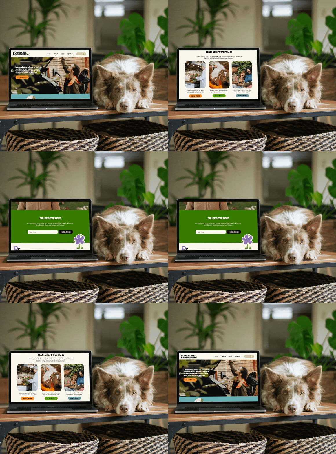


The elongated ‘K’ was inspired by the existing logo of the Koggenland municipality to make it recognisable as a sub-brand.
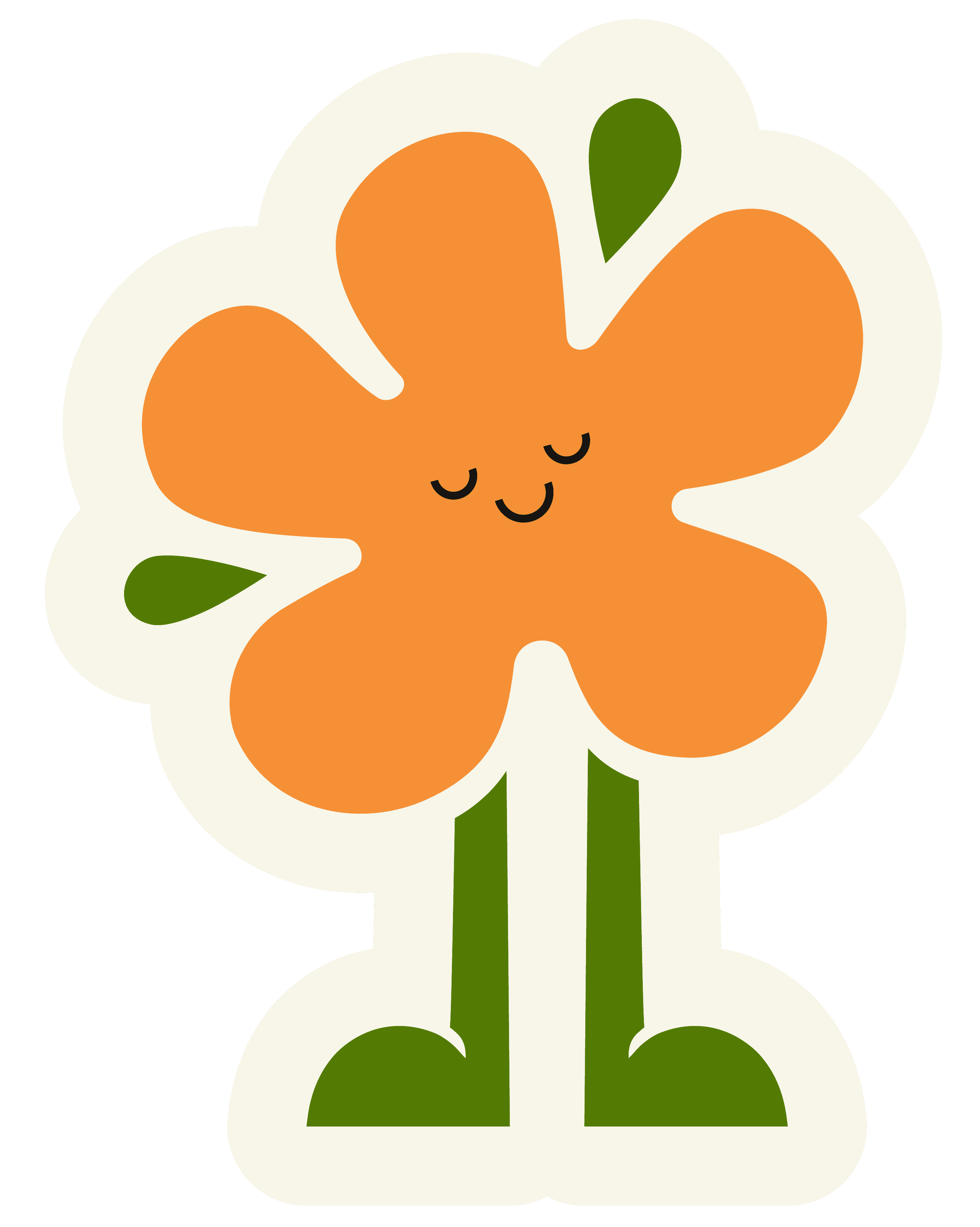
Unified elements of the flower shape and leaves were used in every version of the logo to ensure consistency and recognition.
Rounded shapes were chosen to evoke friendliness, positivity and warmth mixed with sharper edges and a bold sans serif type for legibility and professional feel. The idea is also to use rounded and organic shapes throughtout branding and social media to showcase the brand values, representing polders, nature and state of fluidity and create a sense of connection between residents, municipality and a green future.


DUURZAAM KOGGENLAND
Unified elements of the flower shape and leaves were used in every version of the logo to ensure consistency and recognition.
The elongated ‘K’ was inspired by the existing logo of the Koggenland municipality to make it recognisable as a sub-brand.
Rounded shapes were chosen to evoke friendliness, positivity and warmth mixed with sharper edges and a bold sans serif type for legibility and professional feel. The idea is also to use rounded and organic shapes throughtout branding and social media to showcase the brand values, representing polders, nature and state of fluidity and create a sense of connection between residents, municipality and a green future.